Having lived multiple lives in multiple locations over the past few decades has been exciting and has earned us lasting friendships—personal, professional, and ideally both.
One example of such a relationship is with Steve Lucas of Dunedin, ON: a lighting extraordinaire for film and theatre, a jack-of-all-trades (many?!), and an overall “cool” guy, father, and husband.
In early 2025, Steve approached Ruth Ann with an idea: a film festival in Creemore, ON—a village of 1,300 people located within 10 km of Dunedin. Steve’s background in theatre and film, combined with Ruth Ann’s extensive experience in identity design and illustration, felt like a match made in heaven.
The best part of this relationship was trust. Steve said, “We’re doing it.” We agreed, “We’re doing it!” And so it began.
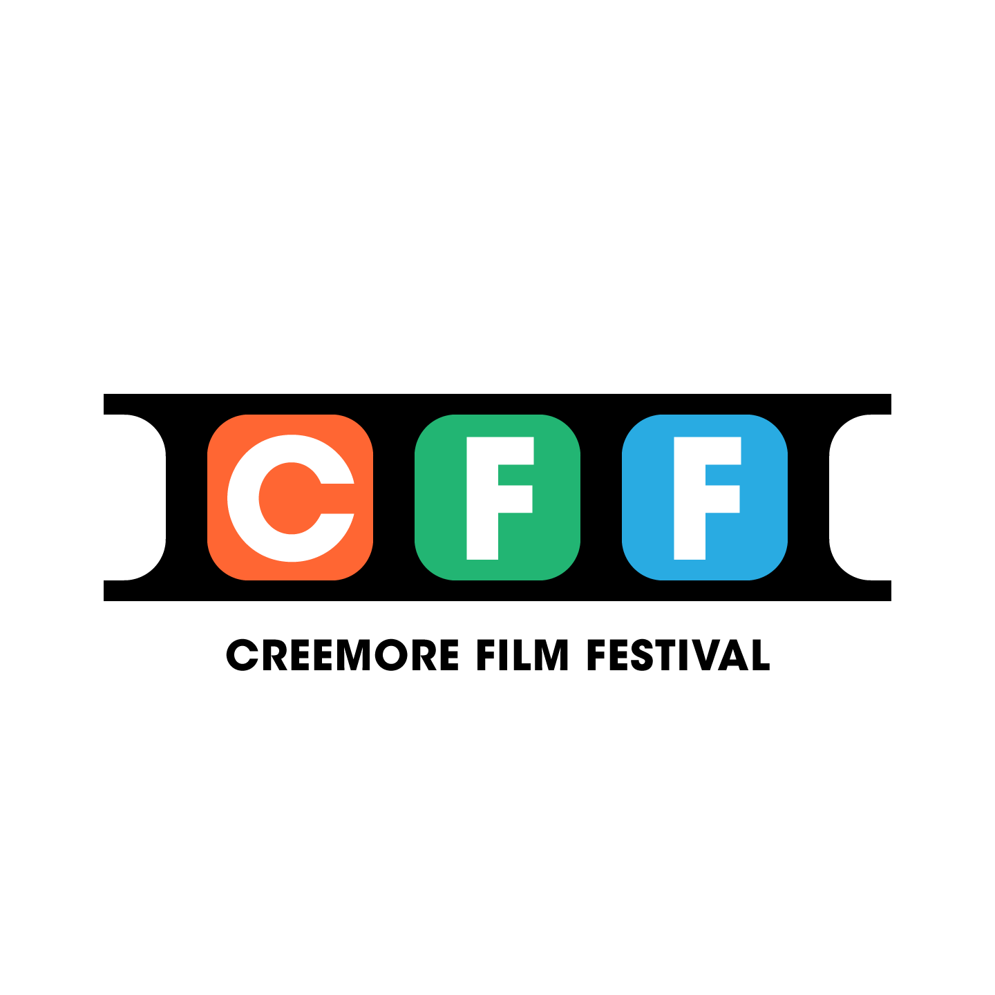
We started simply and classic, using film abbreviations and clean, timless typography in Avant Garde Gothic by Monotype. For colour, we chose RGB—red, green, and blue—the foundational colours of digital media and film.

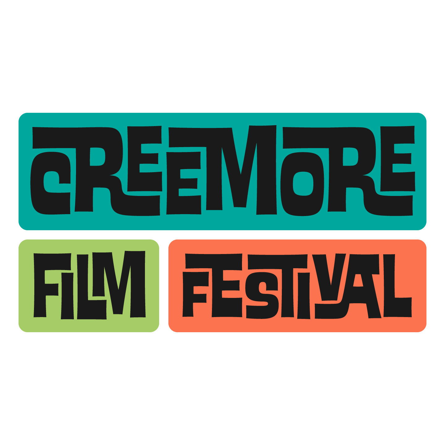
As the process evolved, we settled into our familiar identity (logo) design approach: one safe option, one slightly risky option, and one that comes completely out of left field—something neither the client nor we ever saw coming. This method sets the tone for the project and all work moving forward, giving everyone a clear understanding of the creative direction. Our second concept pushed things typographically and introduced a bit of kitschy fun, using Ed Interlock from The Ed Benguiat Fonts collection by House Industries.

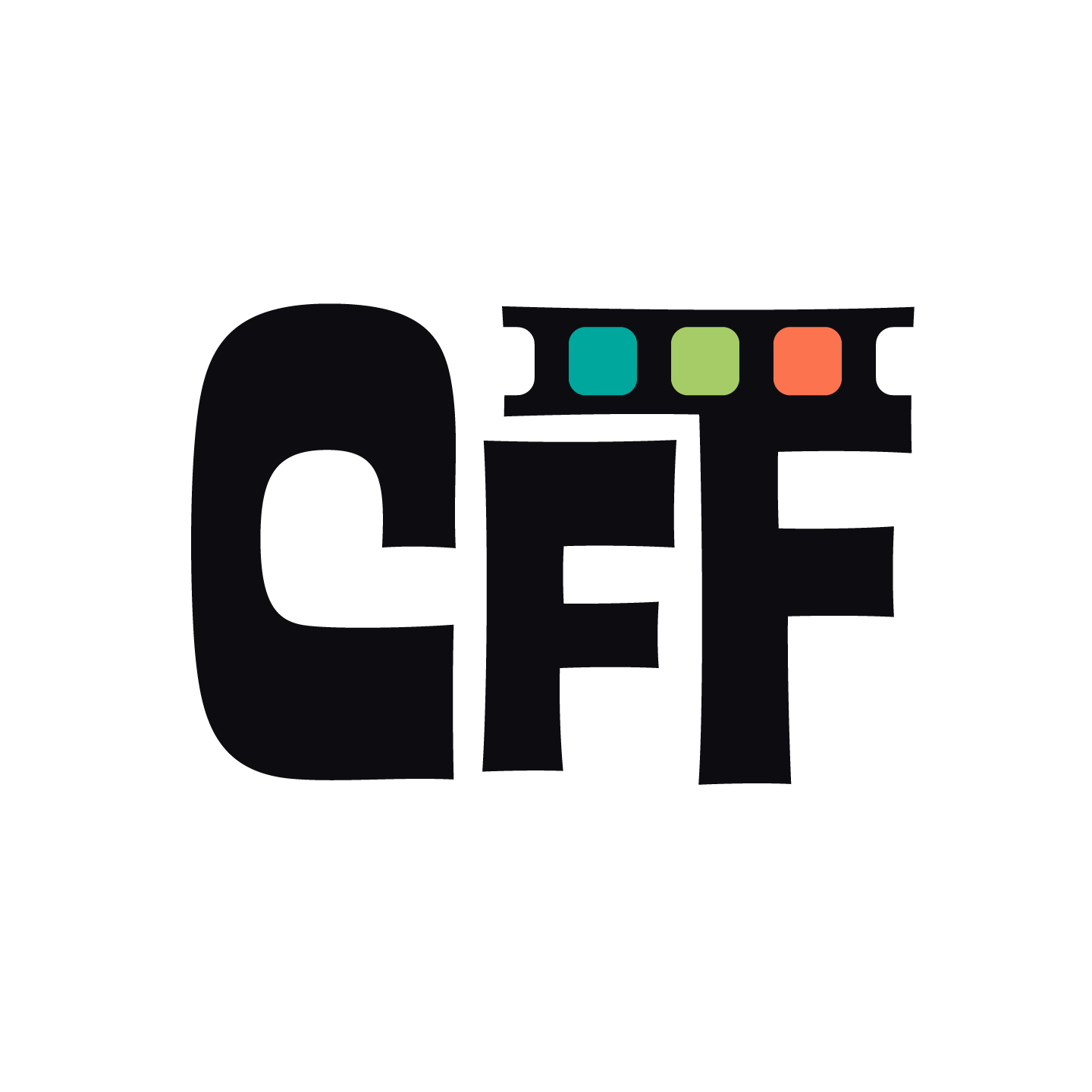

With those concepts established, we were free to experiment and push the identity in a new, unexpected direction while staying true to the spirit of the festival. We rooted this approach in Futura 100 by TypeTogether—a methodical tribute to Paul Renner’s 1920s vision of the typographic future.

Often, the most exciting moments in identity and logo design come from unintended consequences—simply playing around.
In this case, I revisited an old, rounded custom font I had created for another client, thinking its artistic flair might pair nicely with the modernist geometry of Futura. It worked beautifully—and then something unexpected appeared: a set of eyes within the two F’s.
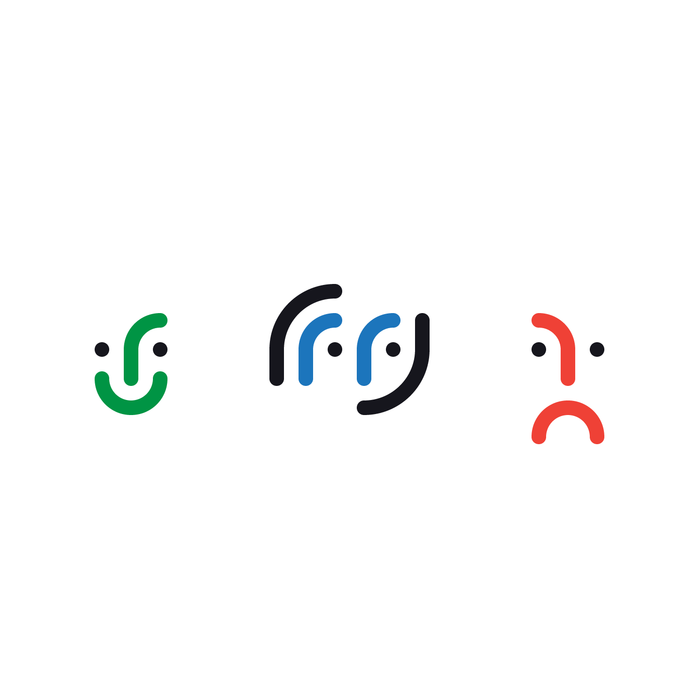

Within the dramatic arts, the comedy and tragedy masks represent a yin-yang balance of human emotion—joy and sorrow expressed through “happy” and “sad” faces. Here, we found three expressions: happy (green), sad (red), and—my favourite—impartial (blue).
This application won Steve over immediately. “My teenage son thinks it’s cool,” he said.
As the kids say (or said), “Let’s go!!!” At that point, we had our fonts, illustrations, and visual language in place, and the rest wrote itself—like a paragraph with a captivating first sentence. Our only concern was that the design might feel too rounded and soft. This film festival needed to be both soft and strong, much like the balance of comedy and tragedy. By keeping the “eyes” rounded while square-capping all other endpoints—and choosing the brightest, most timeless red, green, and blue—we found the perfect balance.
We got creative.


Michael + Ruth Ann
Michael L’Ecuyer, B.Des. + Ruth Ann Pearce, BFA
Chatham Creative Company