As an aspiring (and generally naive) youth working towards an education and career in the arts, everyone and their mother was saying "technology jobs are the future". Which they were, until they weren't.
Enter the trades: electricians, plumbers, HVAC technicians, heavy equipment operators and the like.
After making our exodus from Toronto (after Drake ruined it's "hidden gem" status), Ruth Ann & I moved to Creemore, ON: home of Creemore Springs Brewery, the mad & noisy river(s) and some of the most lovely typography in Ontario. We started an art & design business called coloveration (a collaboration of love) where we hoped to work for small businesses starting out.
We didn't know anyone, BUT we knew a lot and were full of energy.
One of the early eyeopeners was the amount of trades folks who opted to live outside of the city to perfect their respective art forms; carpenters, metal smiths, masons, etc. We quickly got to work on bringing these trades into today through identity design, print design and of course web design and development.
Fast forward nearly 20 years and here we are in Chatham, ON roughly doing the same. In this case for a young(ish) budding Red Seal Carpenter Jordan Arseneau. As always we started at the start; a variety of fonts, colours, illustrations and support elements as we set the tone OR more accurately showed a wide range of "tones" to see what Jordan was thinking/feeling:
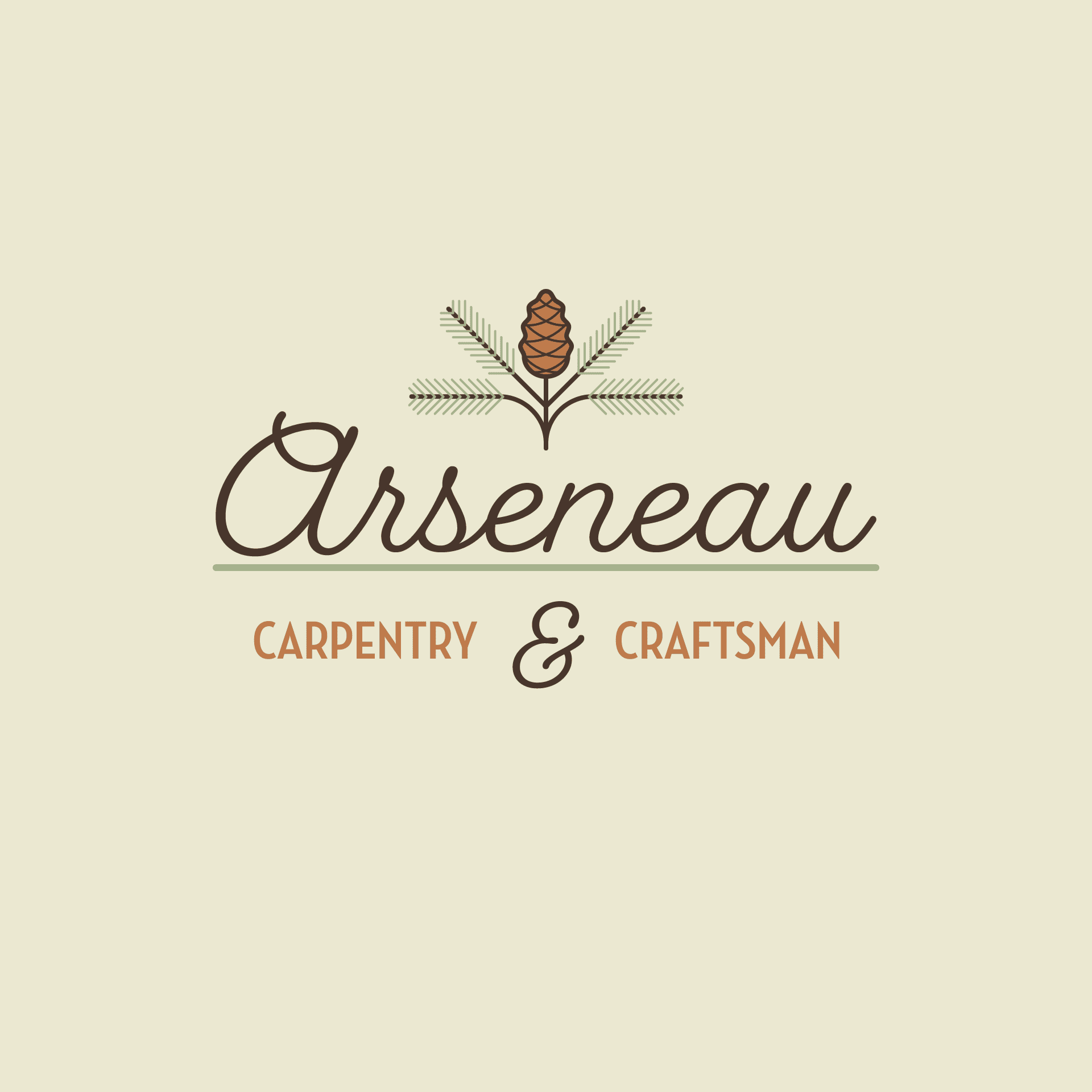
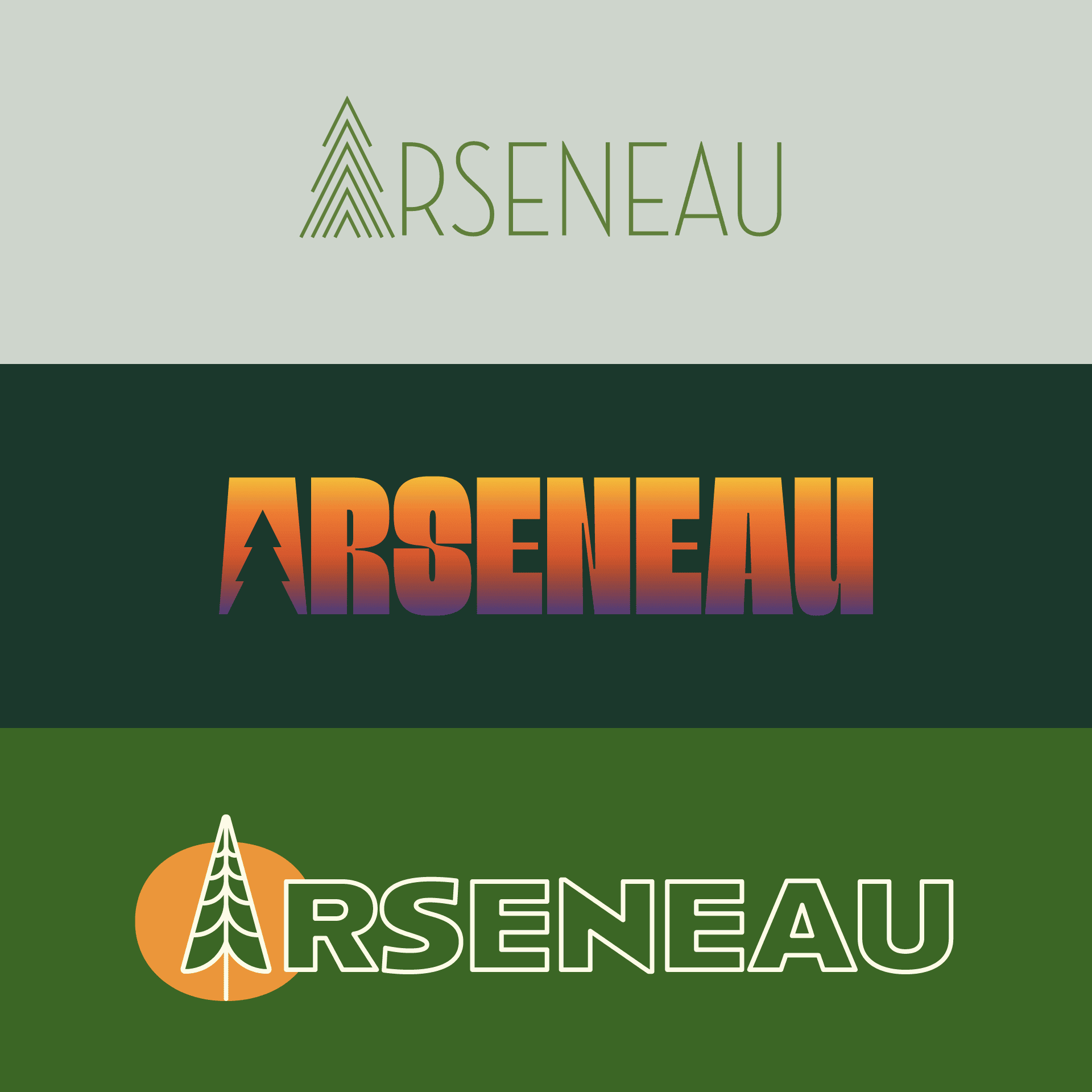
Boy oh boy, WHAT a round! Colour(s) Illustration(s), serif(s), script(s), oh my!!!
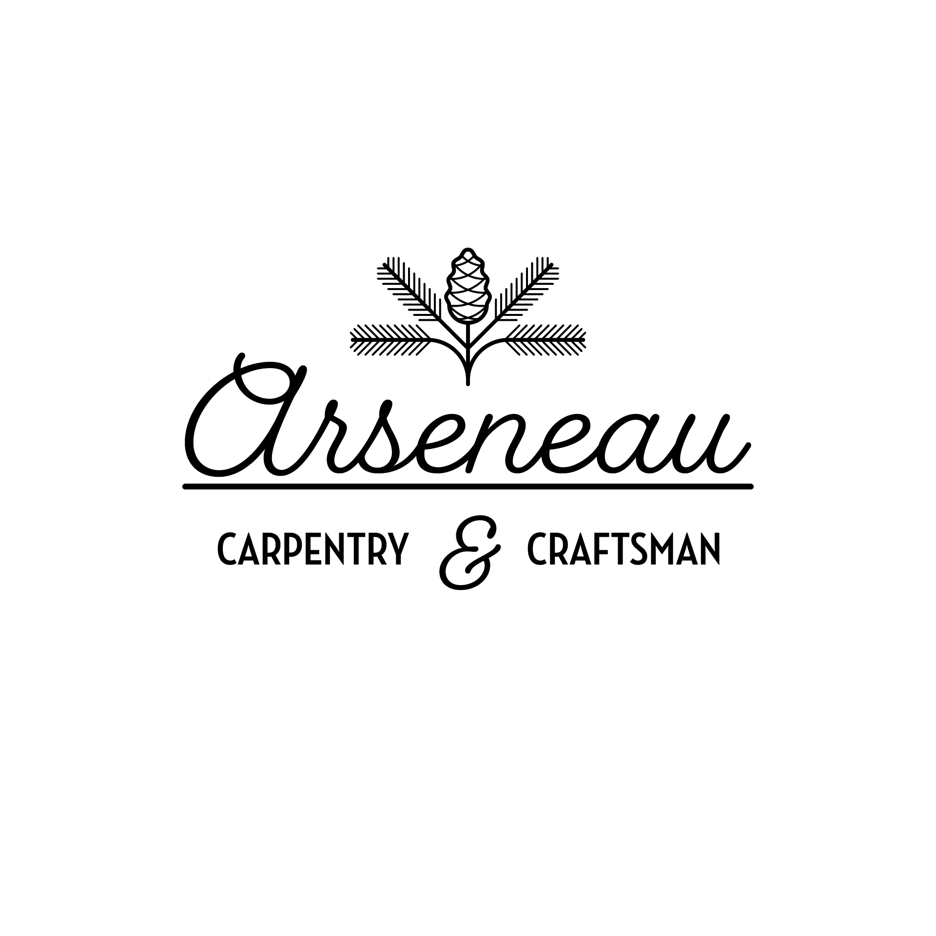
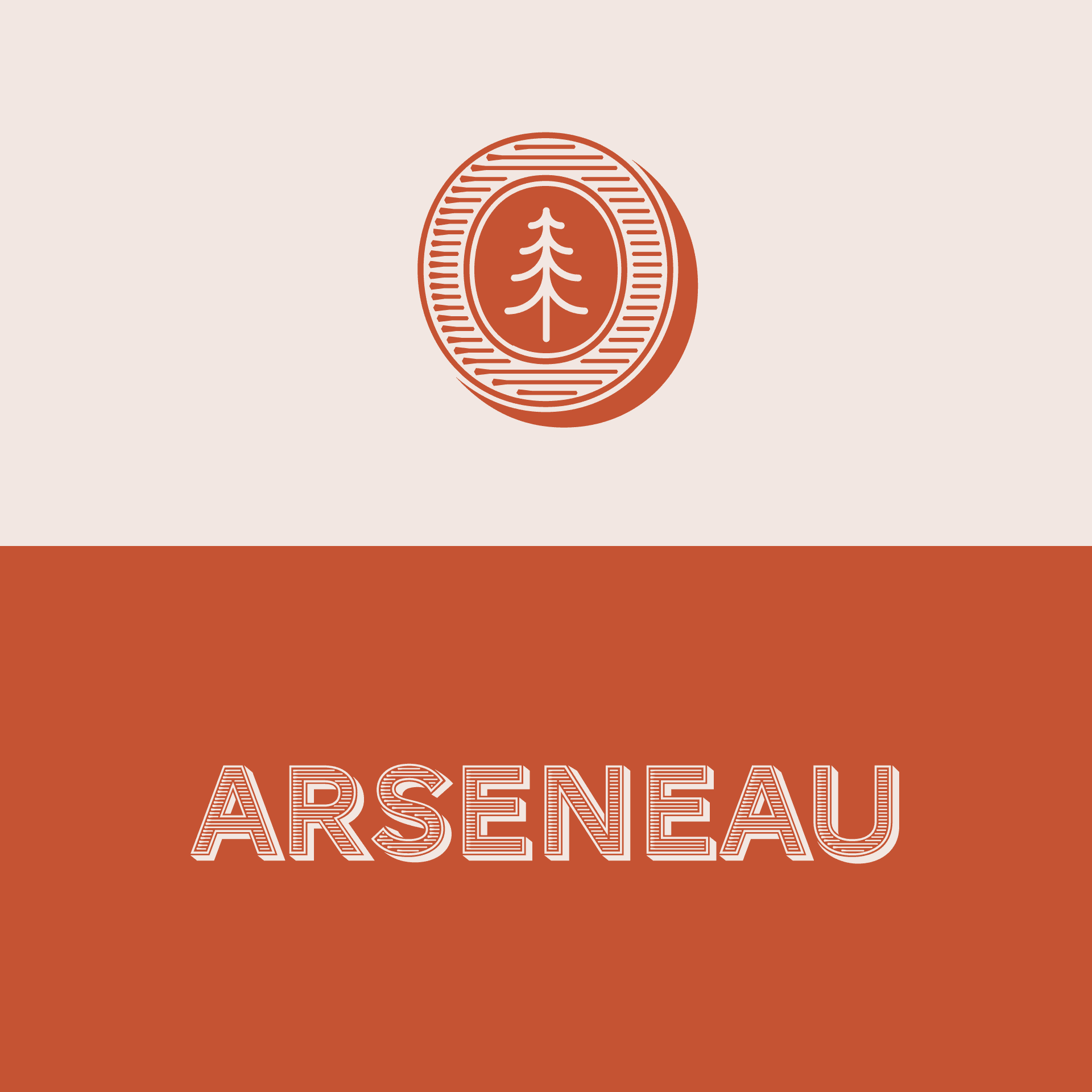
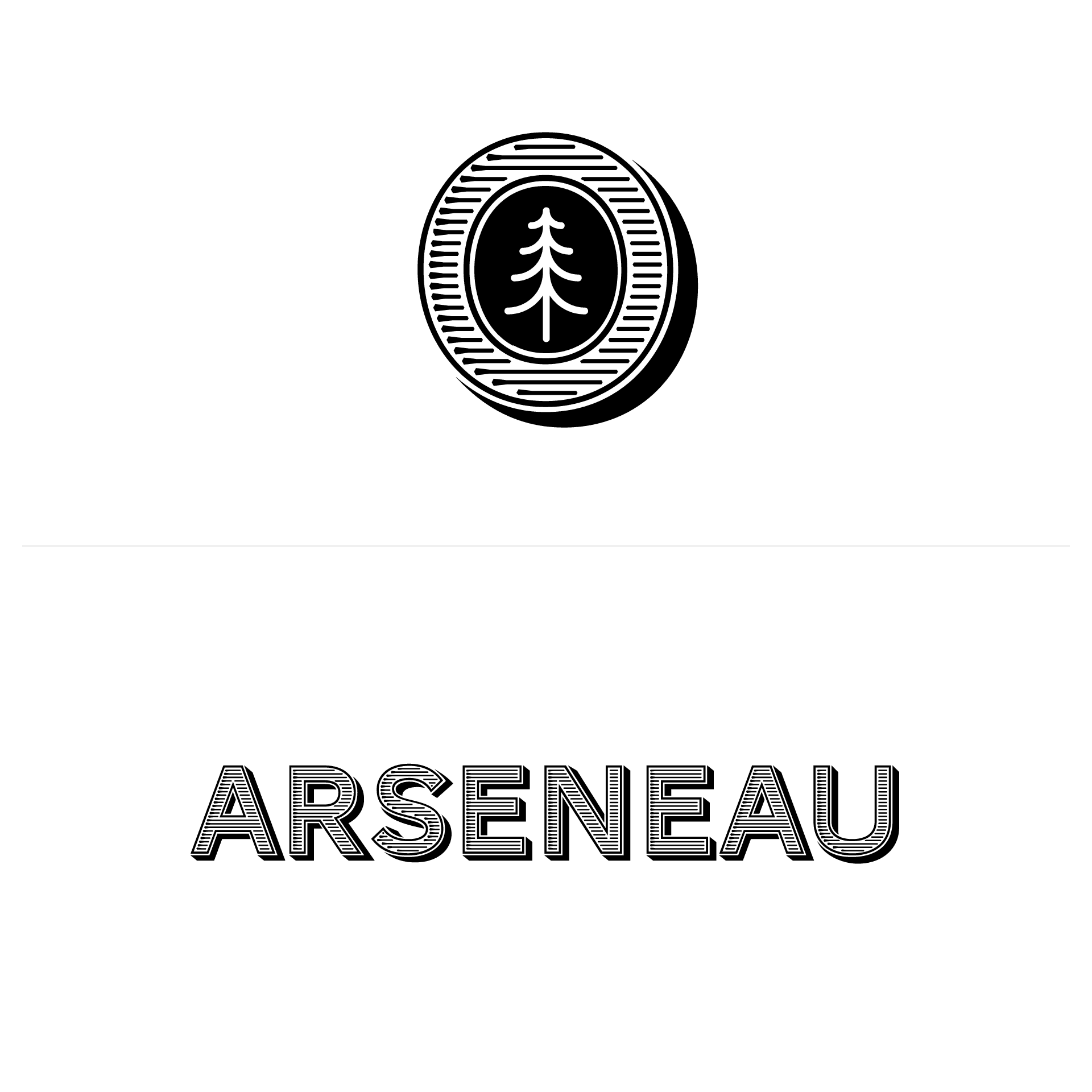
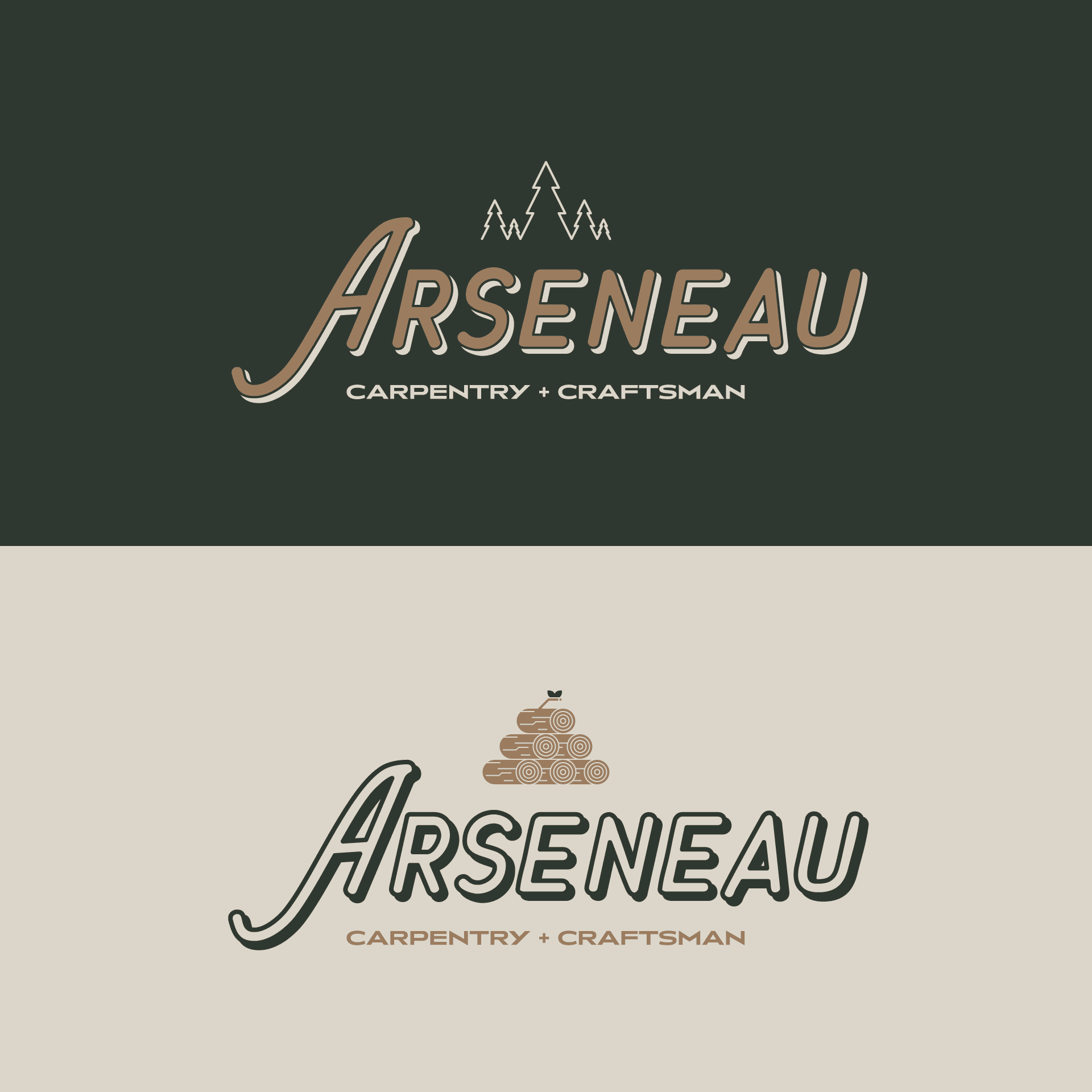
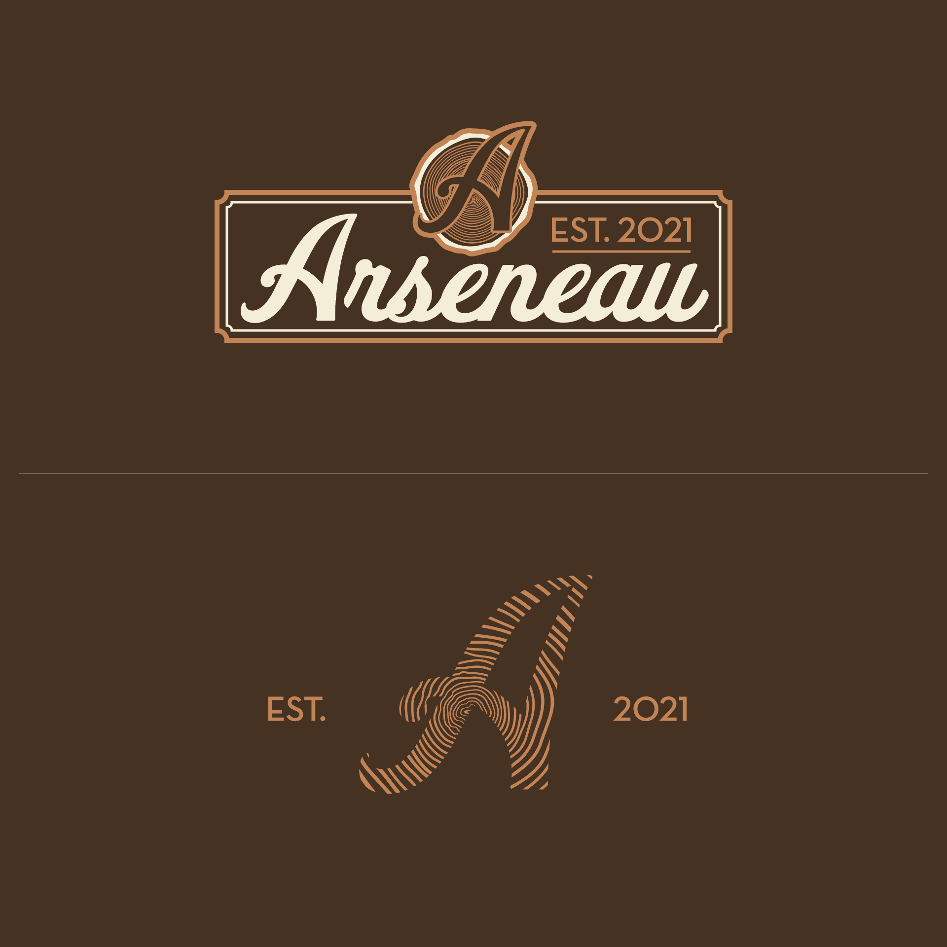
Jordan (the client) was appreciative and overwhelmed. After some digestion time, he introduced us to an old "A" mark he had in his back pocket; we played around with it and introduced some variations of his favourites from round 1. Enter round 2:
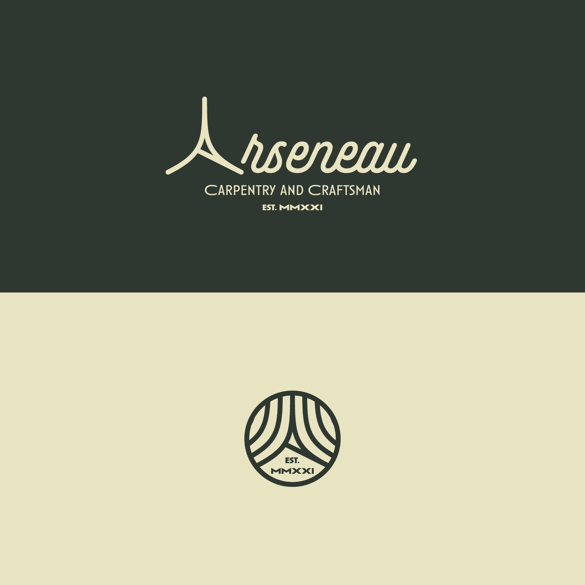
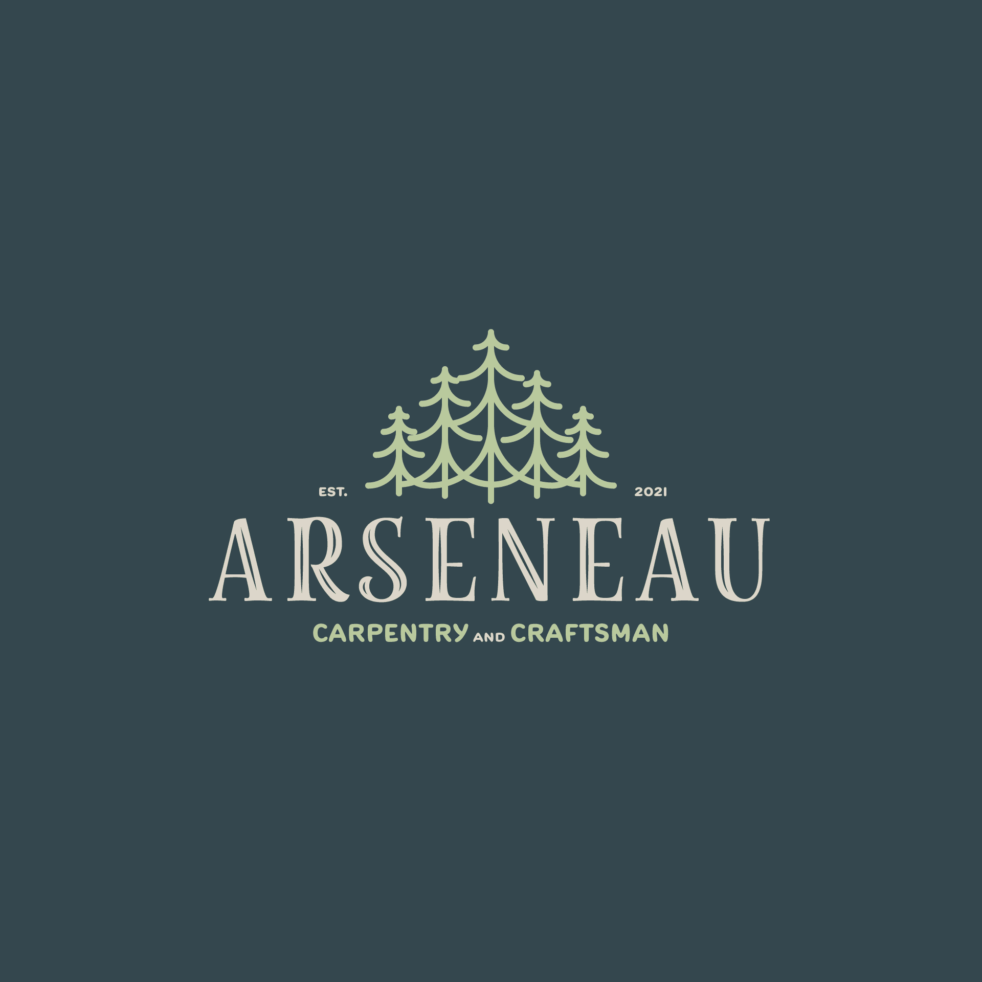
Okay, let's look at everything so far and start making some decisions; that last round, concept 2 the primary script and that secondary serif and carry over the dark green and cream colouring.
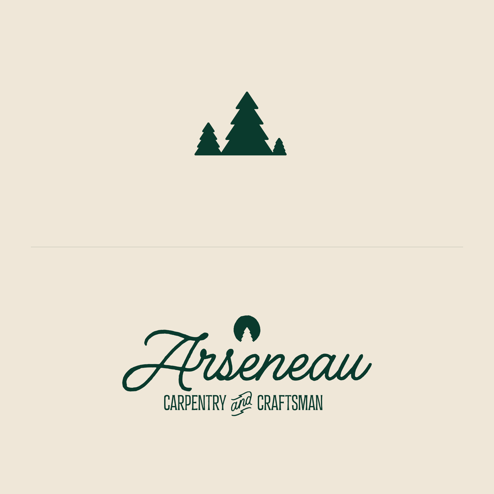
AND previous to that, the 2nd concept with the "woodcut" linear tree; what would those look like put together? Well, let's see in round 3/4:
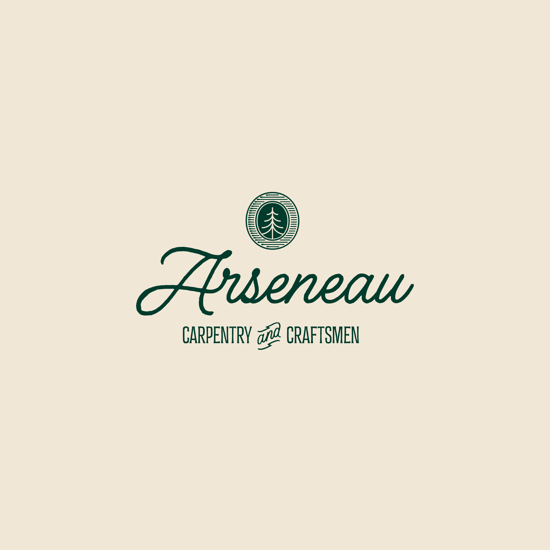
That's it; there it is. Again and again these processes we've had in place for decades now reiterate the importance of the core elements of art & design: line, shape, form, colour, value, space and texture.
Everything in its right place and along with a client who trusts said process, anything is possible for anyone; good work for good people.
We got creative.


Michael + Ruth Ann
Michael L’Ecuyer, B.Des. + Ruth Ann Pearce, BFA
Chatham Creative Company