Few projects bring together everything we value—art, culture, design and community.
CK CanJam 26 checks every box.
When organizers Sarah and Shannon received the green light for the third edition of their hugely popular street art festival, they gave Chatham Creative Company a shout.
The first task was to create a new identity that would establish CK CanJam as a recognizable annual event—one capable of drawing visitors from both near and far.
The identity needed to be clean but exciting. Edgy but approachable. Playful, energetic and flexible enough to connect with a wide audience.
As always, we started at the beginning: playful supporting illustrations, expressive typography and, of course, plenty of colour.
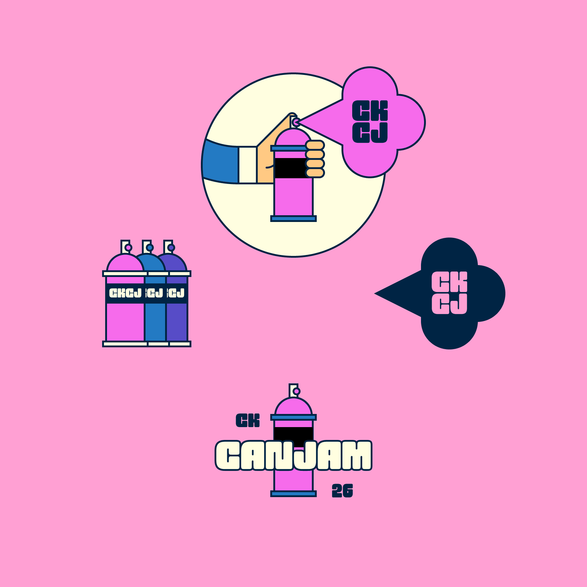
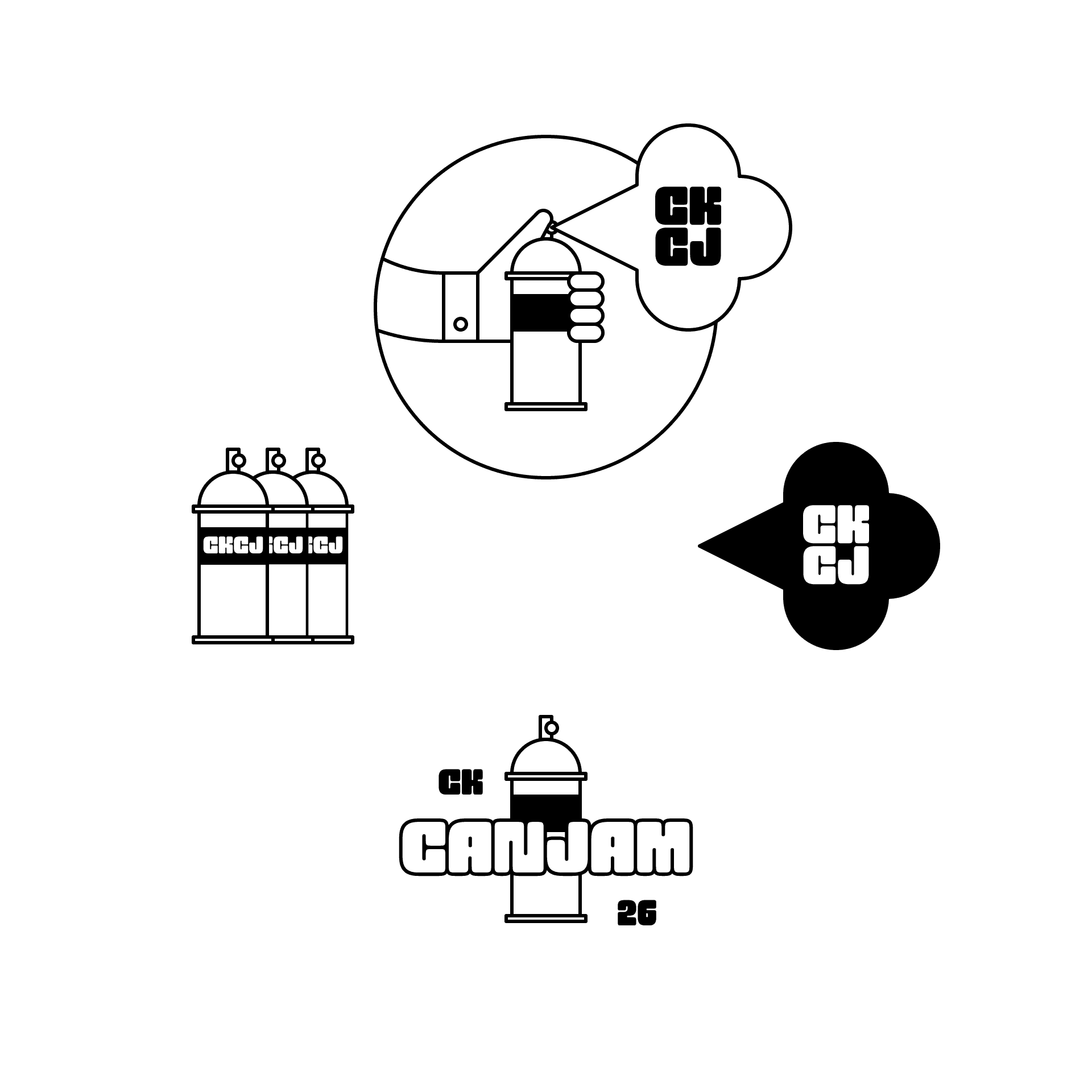
From there, we explored a wide range of type styles—graffiti-inspired lettering, funky linear fonts and several stencil-based options.
So.
Much.
Fun.
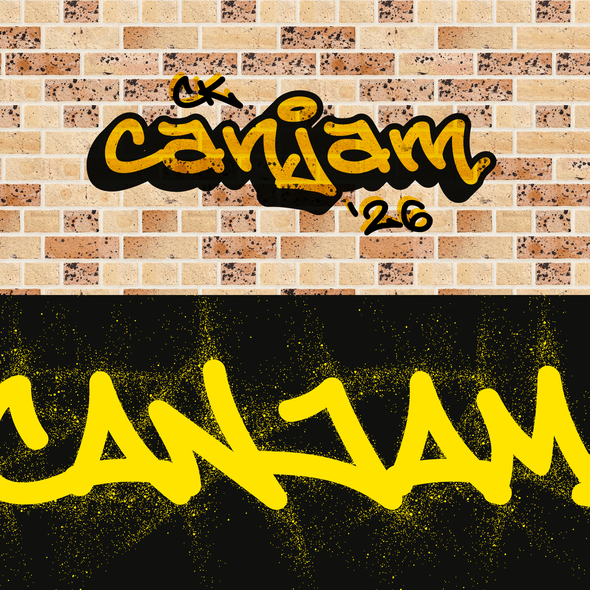
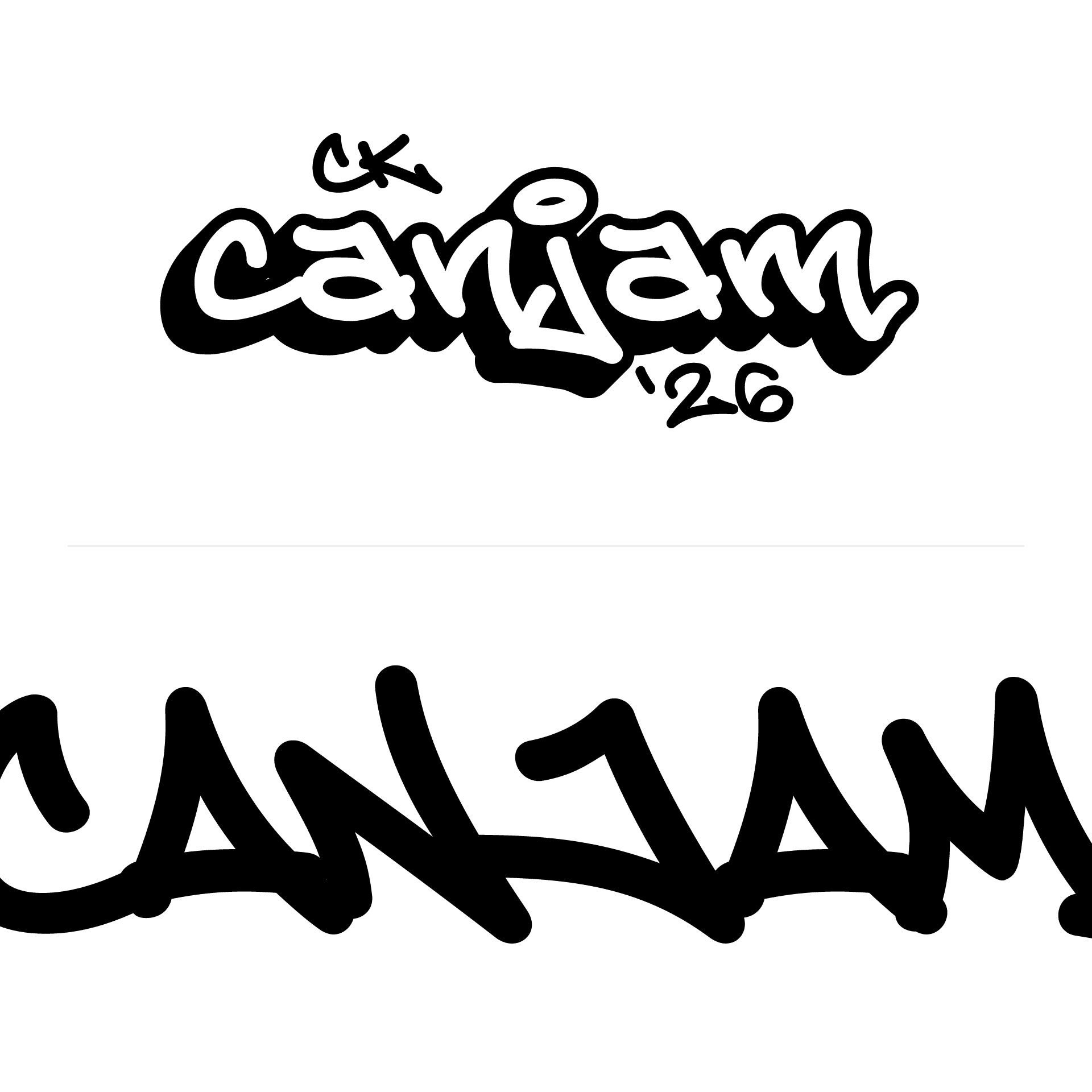
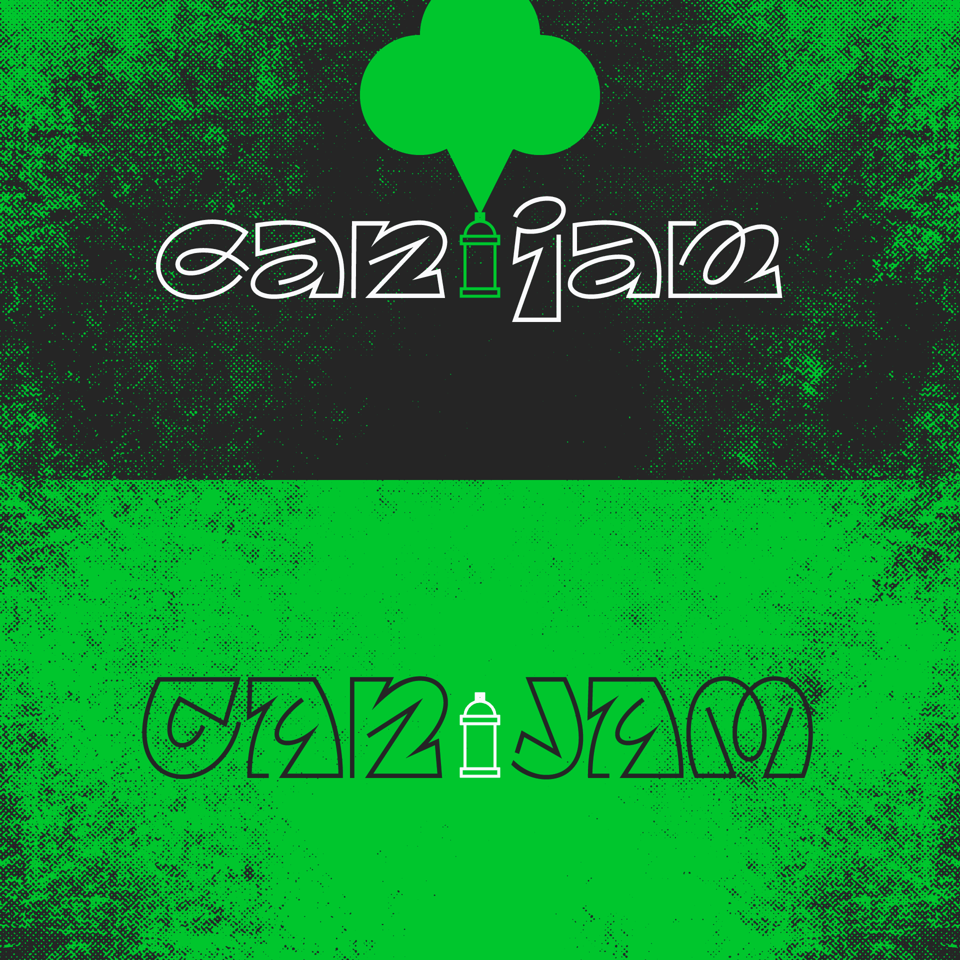
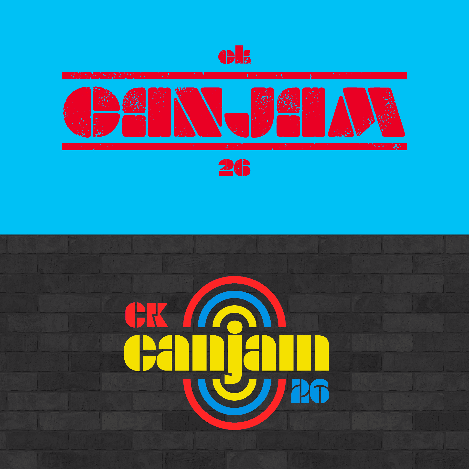
Next came some bubbly retro concepts featuring gradients, bold contrast and plenty of texture.
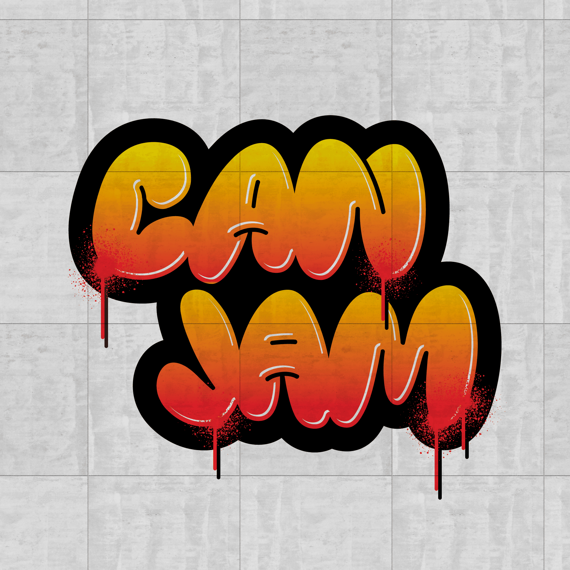
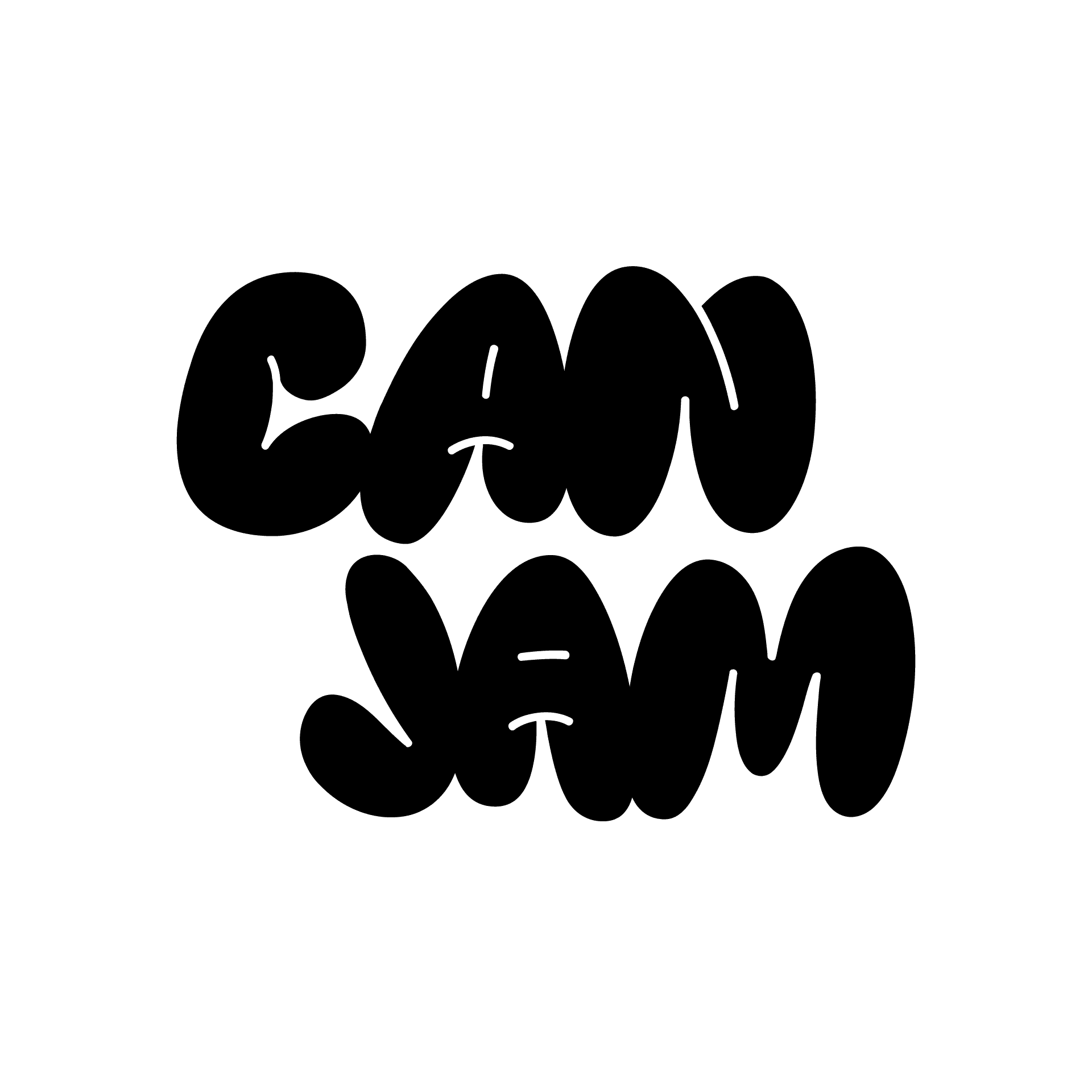
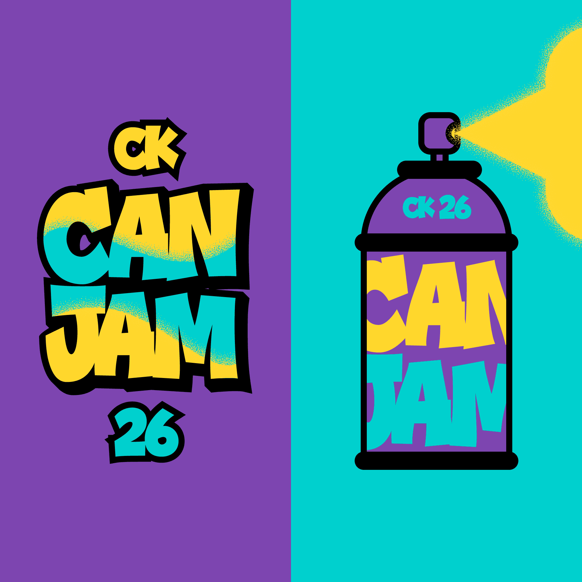
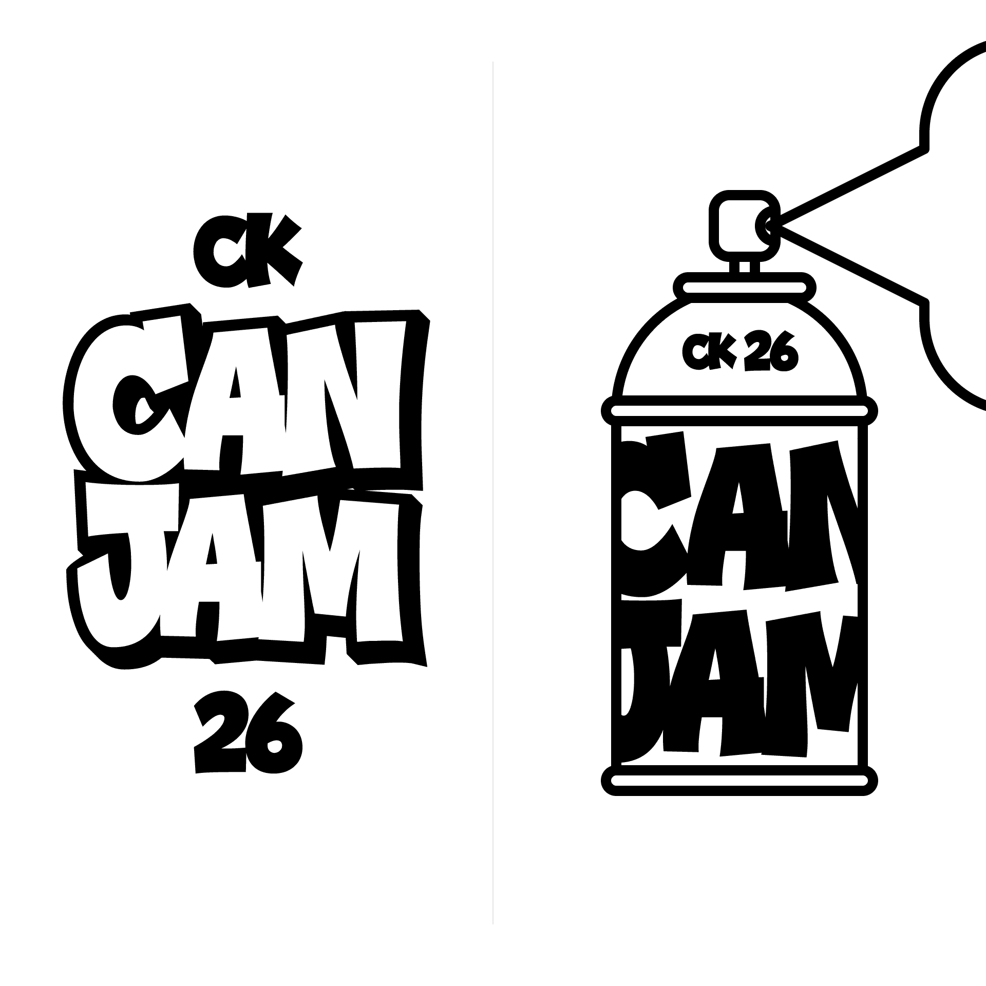
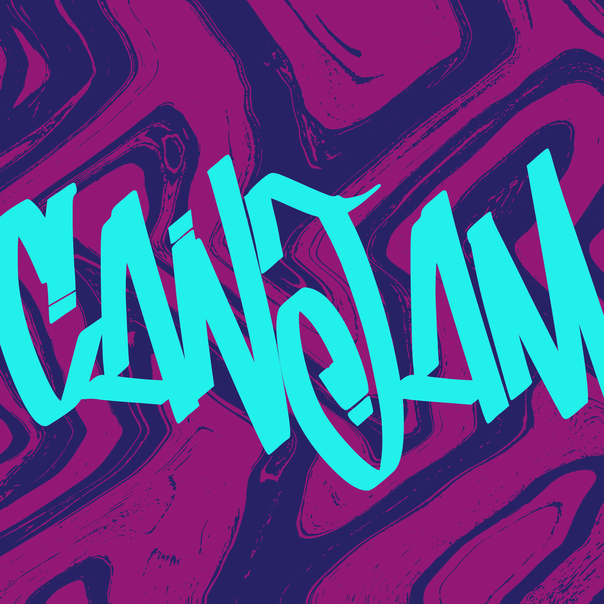
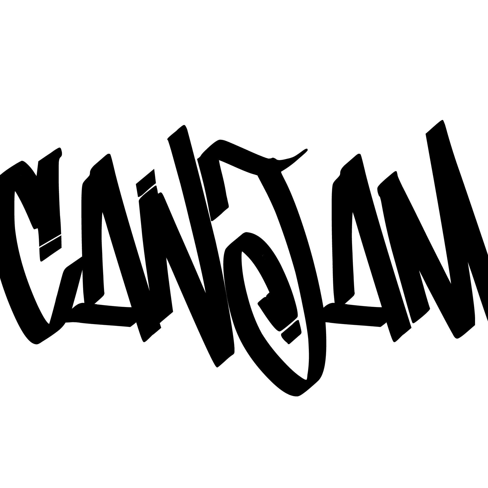
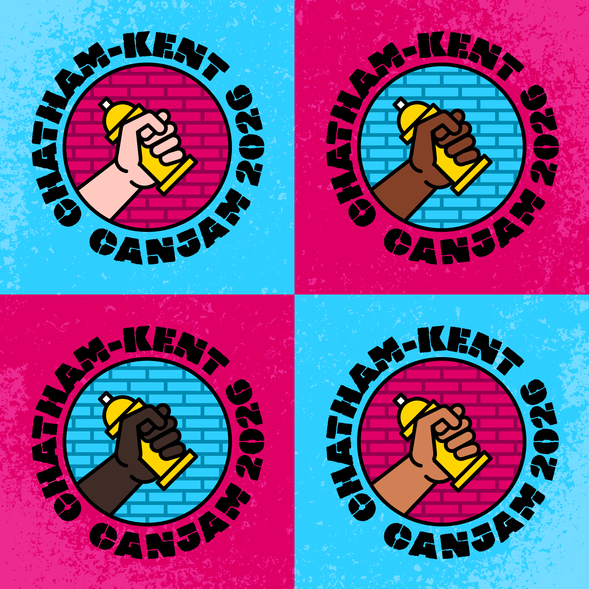
And finally, no street art exploration would be complete without the obligatory hand holding a spray paint can against a brick wall—tested in a variety of styles and colour palettes.
Was there a lot happening in round one? Absolutely. Maybe too much. After some back-and-forth with the client, the direction began to take shape: a combination of retro, stencil and graffiti-inspired typography paired with a nostalgic colour palette.
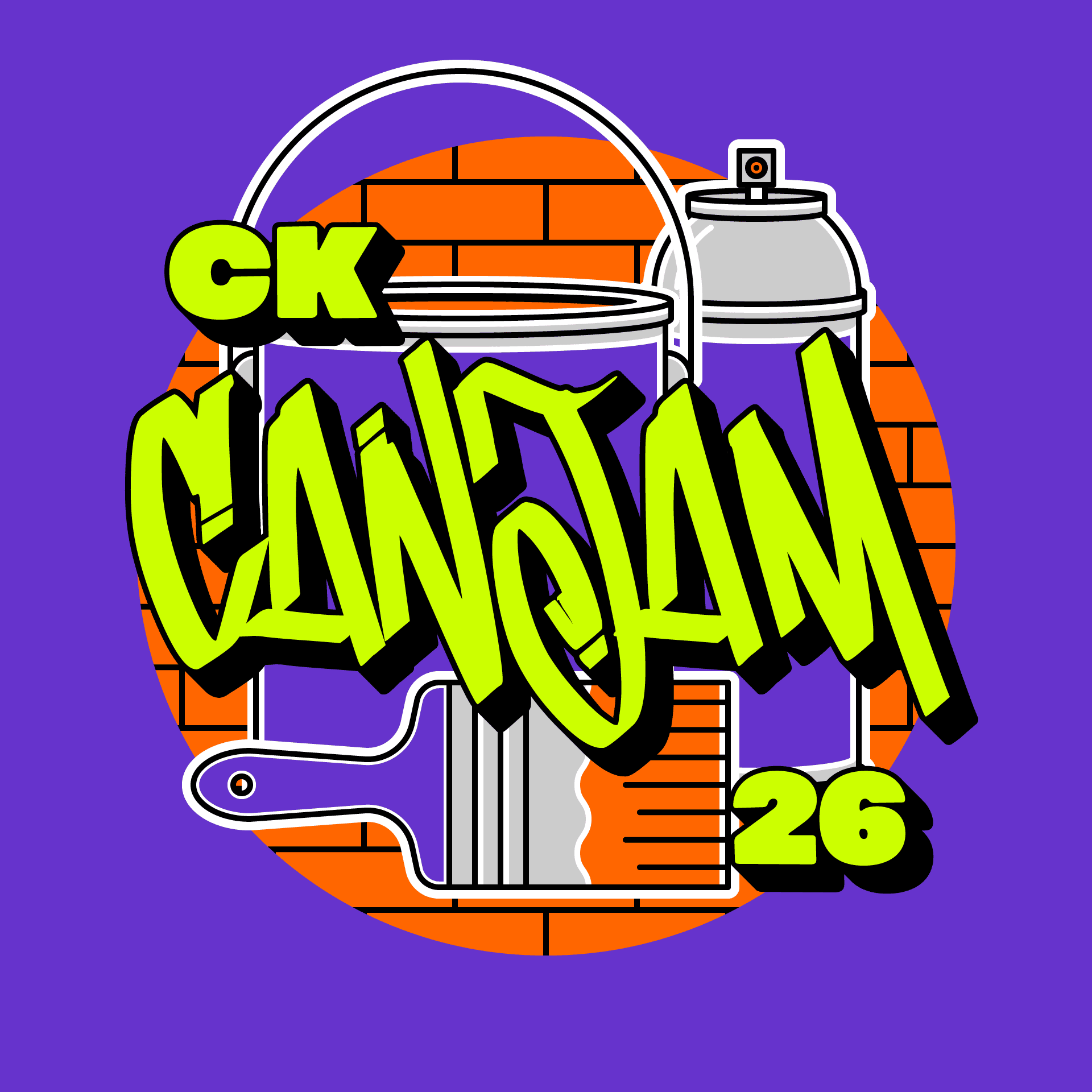
Hello, The Fresh Prince of Bel-Air.
With the visual foundation now in place—colour, texture, line, typography and illustration—we’re moving on to the next phase: designing and building a new CK CanJam website. CK CanJam 26 takes over downtown Chatham in late August.
See you there.
Michael + Ruth Ann
Michael L’Ecuyer, B.Des. + Ruth Ann Pearce, BFA
Chatham Creative Company
